What do you do with an unwieldy name that no-one can remember? Find a more ‘sticky’ one of course. It was a pleasure working with the New Zealand Agricultural Greenhouse Gas Emissions Research Centre (NZAGRC) team on their recent rebrand.
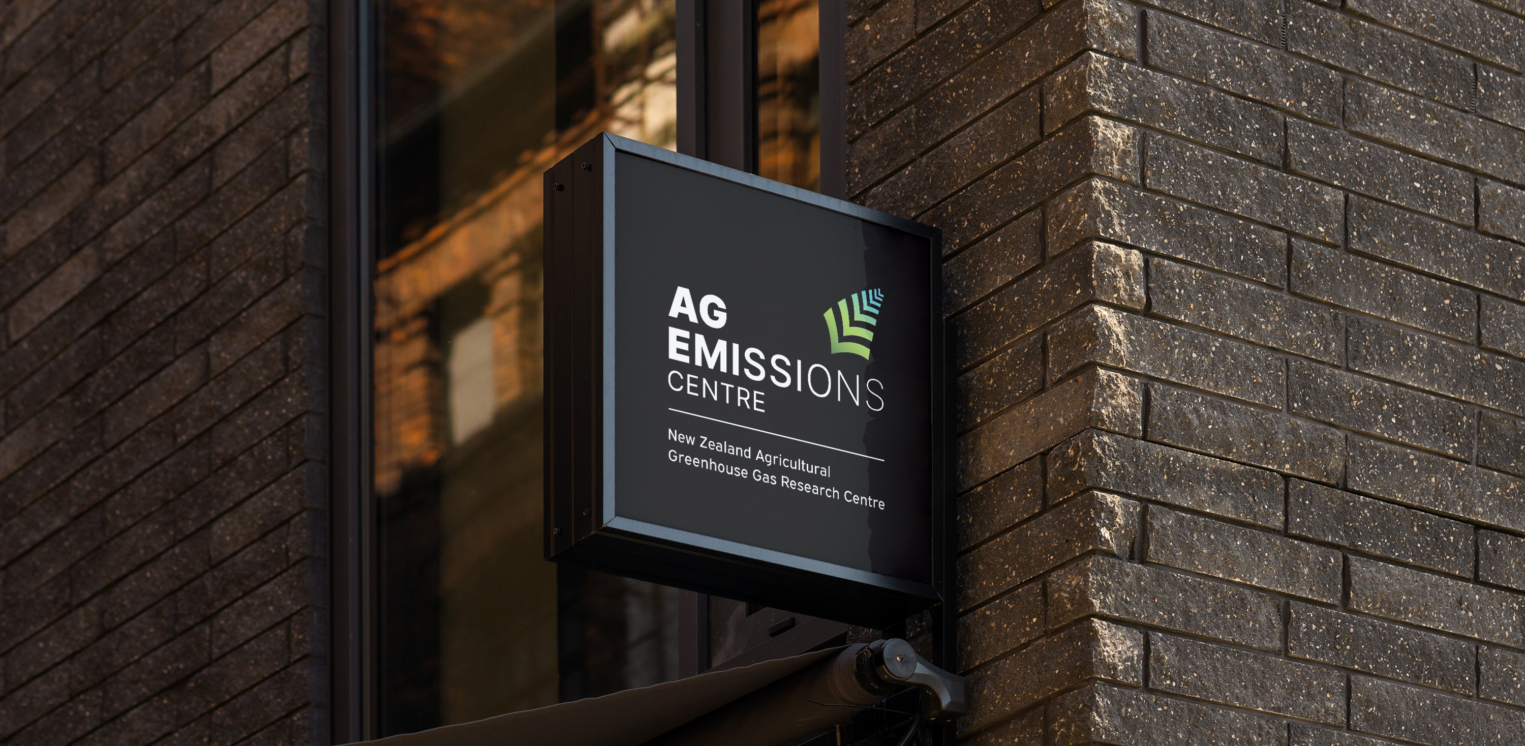
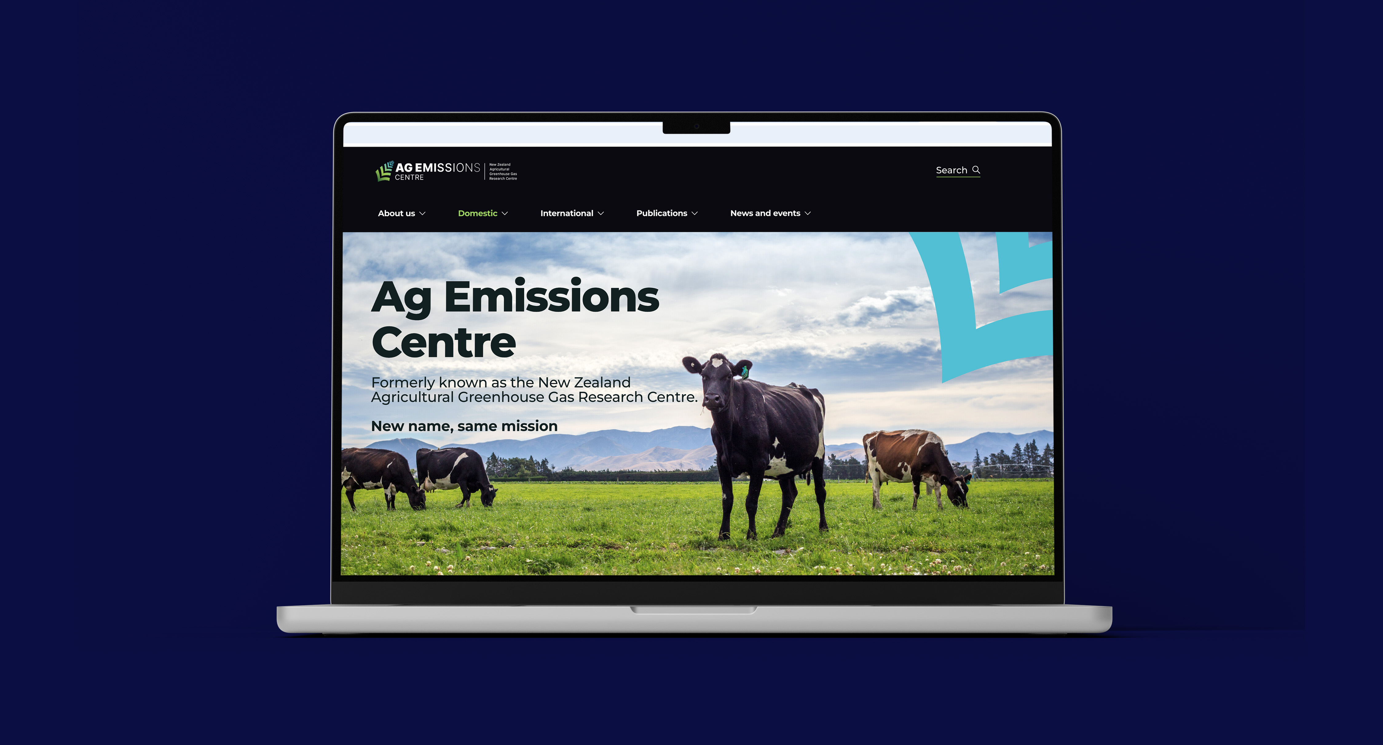
The first cab off the ranks was identifying a new name to build visibility for the brand and greater understanding of what it does. Testing confirmed Ag Emissions Centre as a winner with all stakeholders. With a name in the bag, we created a new logo and visual identity.
The client’s team wanted an identity that spoke of emissions reduction but also one that was recognisablyKiwi in international markets. We designed an icon that can be seen as both downward facing arrows and a New Zealand fern. We further supported this concept of reduction by reducing the type as it reads from left to right.The colours in fern represent the healthy skies and land and the use of black underlines New Zealand identity.
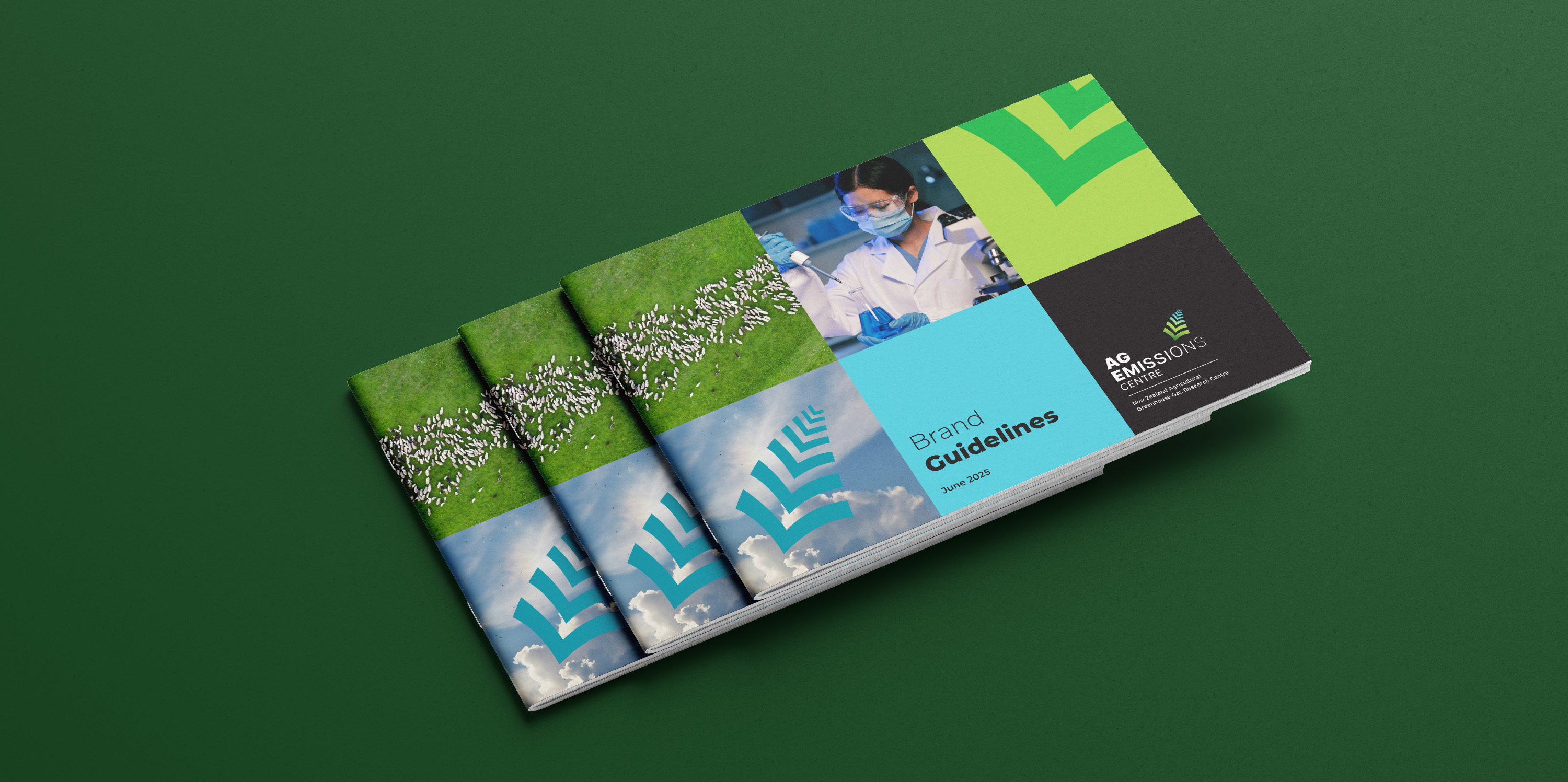
The new look name and identity have succeeded in making the brand memorable, and contemporary with a bit of kiwi flair.